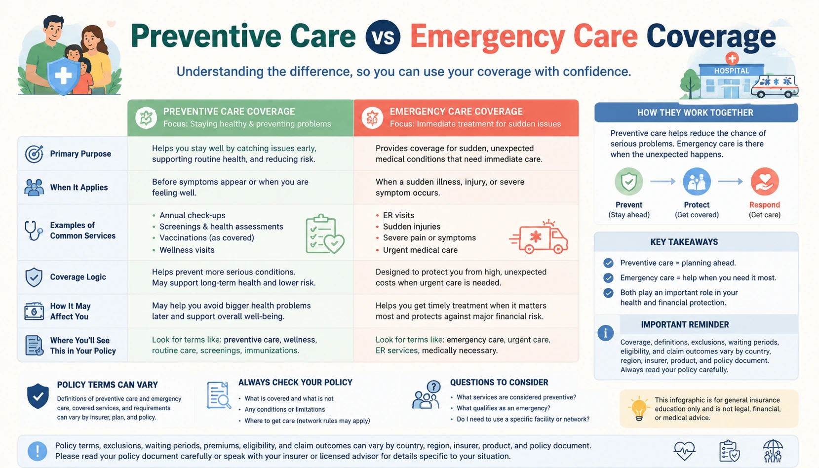
About this insurance infographic
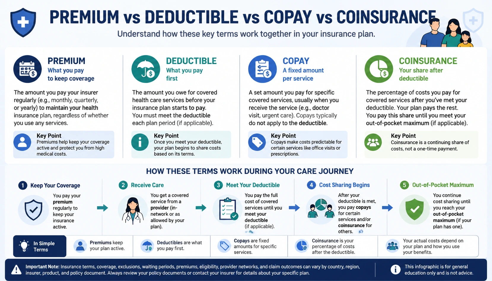
This Premium vs Deductible vs Copay vs Coinsurance Infographic helps readers understand health coverage vocabulary, plan structure, network questions, and cost-sharing concepts through a clear visual layout. The infographic is built for general insurance education, so it explains concepts and terms without recommending a specific insurer, product, coverage amount, or personal decision. It can help consumers, families, founders, educators, and content teams see how the topic fits into policy documents, claims, coverage layers, or risk transfer. As an Insurance Infographic Generator example, it keeps the wording neutral and reminds readers that insurance terms vary by country, region, company, and policy.
Image prompt
Create an insurance knowledge infographic about Premium vs Deductible vs Copay vs Coinsurance. Use a comparison chart structure with a clear title, readable English labels, practical section headings, and organized explanatory text. Explain Premium vs Deductible vs Copay vs Coinsurance as a neutral insurance knowledge infographic using a comparison chart structure. Focus on general insurance education, policy vocabulary, coverage logic, and practical concept clarity without recommending products, companies, limits, or personal decisions. Knowledge points: Define each cost-sharing term in plain English without using fixed dollar examples; Show how premiums, deductibles, copays, and coinsurance affect different moments of care; Clarify that actual costs depend on the plan, provider network, location, and policy terms; Use a comparison layout so readers can see where each term fits in the payment flow. Image description: This premium vs deductible vs copay vs coinsurance infographic explains insurance concepts in a clear visual format for consumers, families, founders, educators, and content creators. Visible page description to align with: This Premium vs Deductible vs Copay vs Coinsurance Infographic helps readers understand health coverage vocabulary, plan structure, network questions, and cost-sharing concepts through a clear visual layout. The infographic is built for general insurance education, so it explains concepts and terms without recommending a specific insurer, product, coverage amount, or personal decision. It can help consumers, families, founders, educators, and content teams see how the topic fits into policy documents, claims, coverage layers, or risk transfer. As an Insurance Infographic Generator example, it keeps the wording neutral and reminds readers that insurance terms vary by country, region, company, and policy. Include a clear note that policy terms, exclusions, waiting periods, premiums, eligibility, and claim outcomes can vary by country, region, insurer, product, and policy document. Do not provide personalized insurance advice, specific product recommendations, specific coverage amounts, real-time quotes, legal guarantees, payout promises, or invented policy rules.