
Biology Infographic16:9
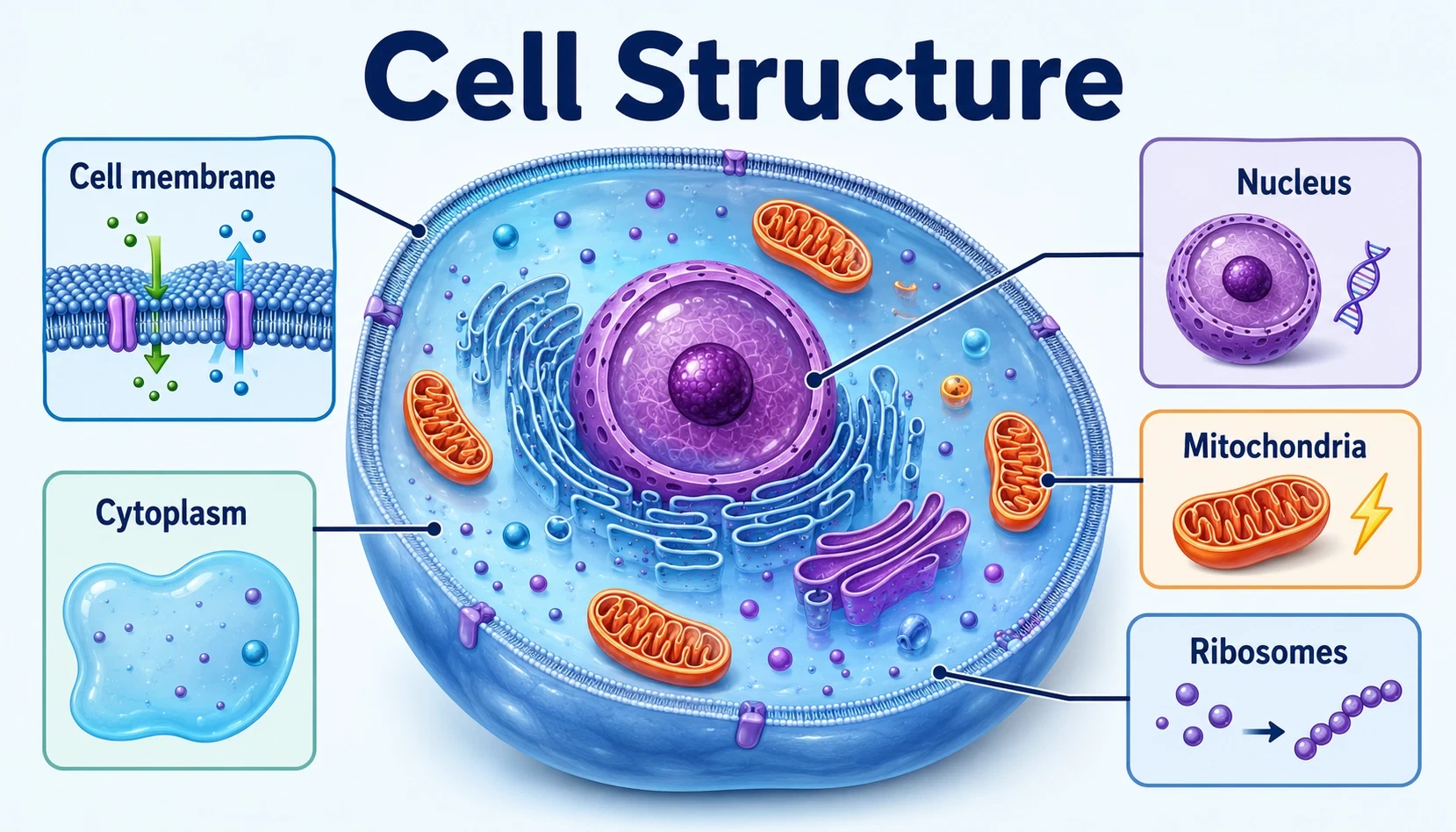
Cell Structure
A biology infographic that maps the membrane, nucleus, cytoplasm, mitochondria, and other core organelles in a wide classroom-friendly layout.
Create SimilarCURATED VISUAL IDEAS
Explore science infographics, educational visuals, poster-style summaries, and carousel-style examples created from topics, notes, and plain text.

Browse examples across science, education, study notes, product ideas, process visuals, and social visuals.
A biology infographic that maps the membrane, nucleus, cytoplasm, mitochondria, and other core organelles in a wide classroom-friendly layout.
Create Similar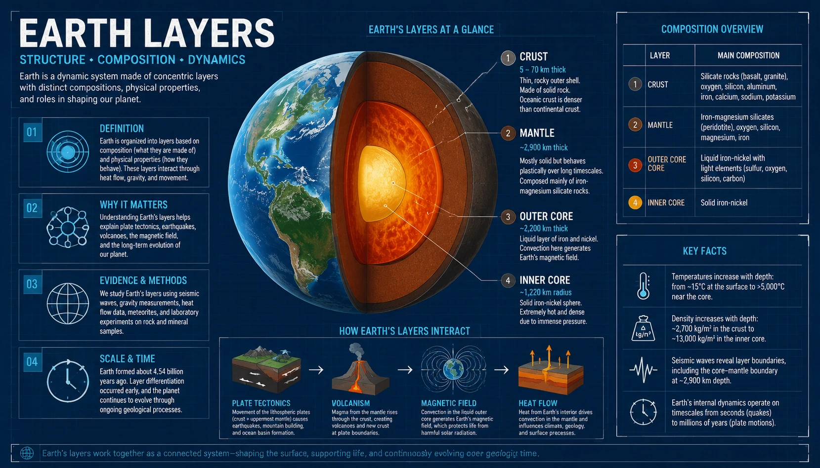
An earth science infographic that explains the crust, mantle, outer core, inner core, and the relationship between internal layers and surface processes.
Create Similar
A recipe process infographic that turns ingredients, preparation, baking, and serving steps into one easy-to-follow cooking visual.
Create Similar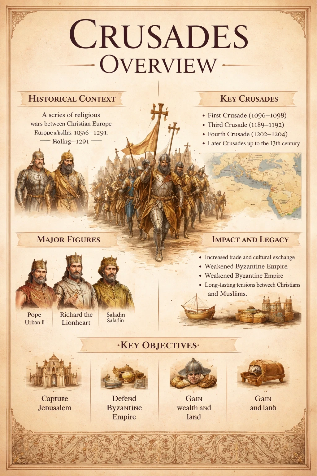
A history infographic that organizes the causes, major campaigns, key groups, and historical consequences of the Crusades in a tall editorial layout.
Create Similar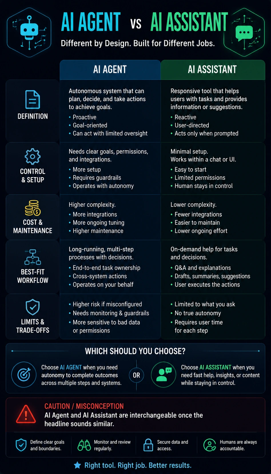
A comparison infographic that separates autonomy, tool use, workflow scope, supervision needs, and practical use cases for AI agents and AI assistants.
Create Similar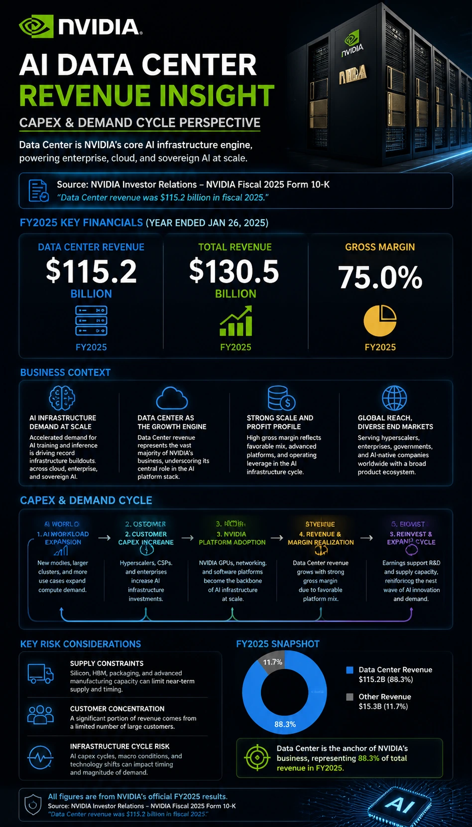
A financial report infographic that summarizes Nvidia's AI data center revenue growth, demand drivers, and investor-facing market context in a mobile-friendly format.
Create SimilarInfographic examples are visual references that show how information can be organized into clear sections, labels, diagrams, and summaries. KnowLens examples show how topics, notes, and plain text can become structured infographics, visual summaries, poster-style visuals, and carousel-style graphics.
Find examples for different use cases, then create your own version with KnowLens.
Visual examples for biology, physics, astronomy, earth science, and classroom science topics.
Cells, anatomy, genetics, ecosystems, and other life science visuals.
Geology, weather, climate, Earth layers, and natural system visuals.
Step-by-step visuals for workflows, operations, tutorials, and technical sequences.
Visual recipe cards with ingredients, prep steps, cooking flow, and serving notes.
Historical explainers, civilization overviews, timelines, and visual learning pages.
Market insight, financial report, insurance, roadmap, and industry report visuals.
Study guides, classroom posters, lesson visuals, and structured learning summaries.
Use these prompts as starting points. Complete text and clear key points usually produce better visuals.
Explain seed germination in 5 stages for middle school students.
Prompt 2Create an infographic about solar storms, including causes, effects, and key facts.
Prompt 3Turn these notes about DNA replication into a poster-style infographic.
Prompt 4Make a visual summary of the water cycle with simple labels.
Prompt 5Create a step-by-step infographic for a simple pasta recipe.
Prompt 6Explain my product idea in 5 clear sections.
Prompt 7Turn my study notes into a visual study guide.
Prompt 8Create a comparison infographic showing the pros and cons of two options.
Prompt 9Make a process infographic for a 4-step workflow.
Prompt 10Create a social media infographic that explains one idea clearly.
For better results, include the topic, audience, key points, steps, facts, and examples you want to show.
CREATE SIMILAR
Start from an example, then use your own text, notes, or topic.
Browse the gallery and choose a style or structure that fits your idea.
Paste your topic, notes, or short explanation.
Create a new infographic, visual summary, poster-style visual, or carousel-style graphic.
Examples help you understand what kind of visual structure works best for your idea.
Use examples to decide whether your idea works best as a timeline, process, comparison, poster, or visual summary.
Strong infographics use focused key points, short labels, and clear visual grouping.
Seeing examples helps you write better prompts and provide more complete input.
Start from a proven format instead of beginning with a blank page.
Explore more ways to create infographic-style visuals with KnowLens.
Turn topics, notes, and plain text into structured infographics.
Turn plain text into infographic-style visuals.
Make clear infographics without design skills.
Create structured science infographics from science topics and notes.
Create life science visuals for cells, body systems, ecosystems, and biology lessons.
Create visuals for geology, weather, climate, oceans, and Earth systems.
Create classroom visuals, study guides, and learning summaries.
Create step-by-step workflow visuals, tutorials, and process guides.
Turn ingredients and cooking steps into visual recipe cards.
Create poster-style visuals from ideas and notes.
Create carousel-style visuals for sharing.
Common questions about KnowLens infographic examples.
Infographic examples are finished visuals that show how one topic can be organized into sections, labels, charts, timelines, comparisons, or step-by-step blocks. They help you see the structure before you start creating your own version, which makes it much easier to decide whether your content should become a science explainer, a classroom study guide, a recipe process card, a financial summary, or a poster-style visual.
Yes. Each example can act as a starting point for a new visual. If you like the pacing, hierarchy, or general composition of an example, you can use it as inspiration, replace the topic with your own notes or text, and generate a new infographic that keeps the same broad structure while changing the actual content. This is especially useful when you know the kind of layout you want but have not written the final prompt yet.
The gallery is intentionally mixed so you can compare different visual structures side by side. It may include biology diagrams, earth science explainers, recipe process infographics, financial report summaries, history visuals, comparison charts, roadmap layouts, and study-guide style examples. The goal is to show different ways plain text can become a readable visual system rather than repeating one narrow format.
The best results usually come from complete input. Include the topic, intended audience, the main sections or stages you want covered, any required labels, and the kind of structure you want the infographic to use. If your content has steps, comparisons, milestones, definitions, or key facts, naming them directly gives KnowLens more to work with and usually leads to a clearer, more accurate, and more useful result.
No. KnowLens is built for people who have information to explain but do not want to start from a blank canvas. Instead of manually placing every title, box, and label, you focus on the content and the system helps shape that content into a clearer visual hierarchy. That makes it useful for students, teachers, marketers, founders, operators, writers, and creators who want polished visuals without traditional design work.
A normal template gallery usually starts with fixed layouts that you fill in manually. KnowLens examples work differently because they reflect outputs generated from topics, notes, and prompts. That means each example is both a visual reference and a practical hint about how to describe your own content, what level of detail works well, and how much structure is useful when you want the final infographic to feel clear instead of crowded.
Yes. Many examples on this page work well across multiple contexts. A science infographic can support classroom teaching, a comparison layout can work in a blog post or LinkedIn carousel, and a report-style visual can support presentations, briefings, or internal communication. Browsing examples helps you spot which structures feel easiest to reuse for sharing, teaching, or explaining ideas in a professional setting.
Yes. That is one of the main reasons this page exists. If you are unsure whether your topic should become a process infographic, a comparison visual, a roadmap, a study guide, a poster-style summary, or a financial insight card, browsing examples first makes that decision much easier. Once the format is clear, writing a stronger prompt and getting a better result usually becomes much faster and more predictable.
Start with a topic, notes, or plain text. Turn your idea into a clear infographic, visual summary, poster-style visual, or carousel-style graphic.