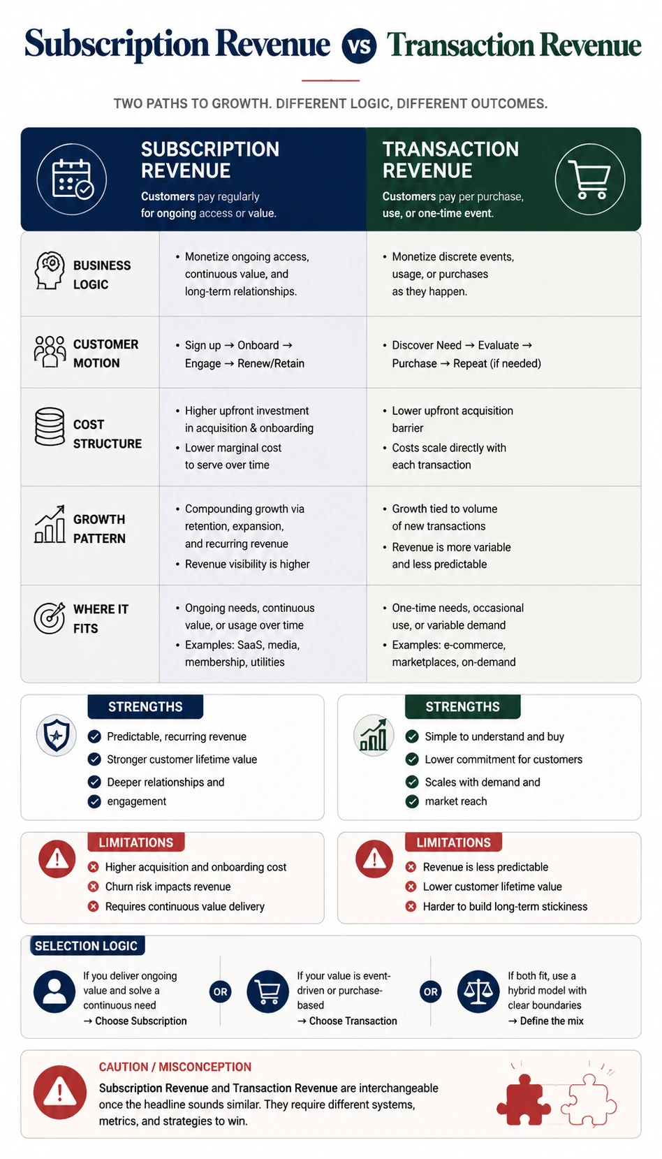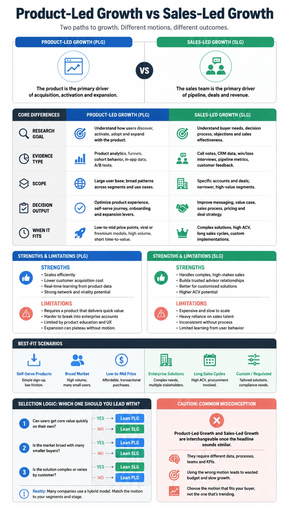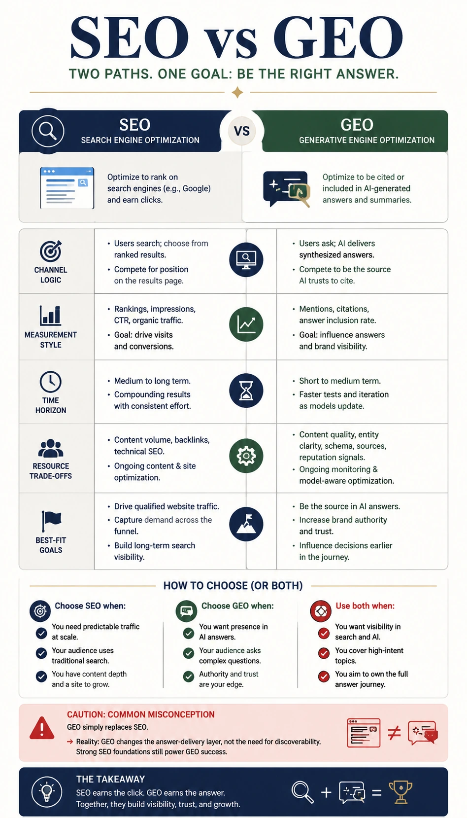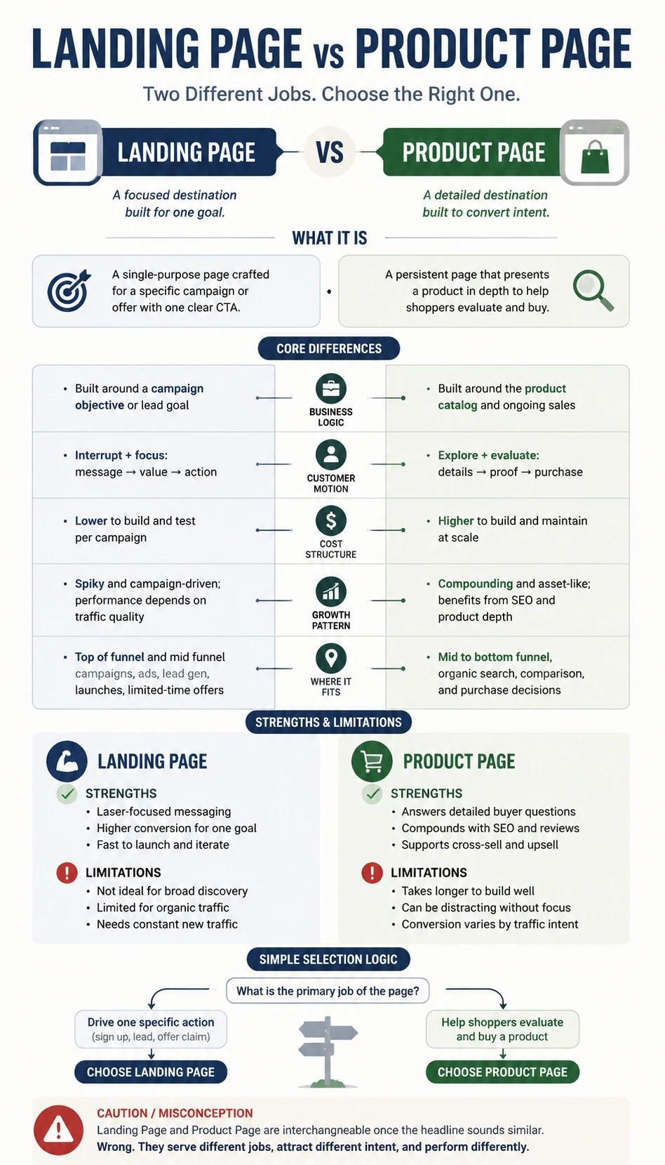
About this comparison infographic
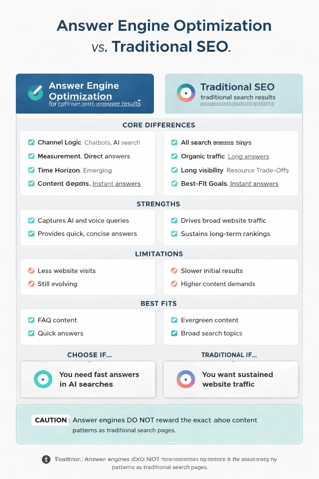
This Answer Engine Optimization vs Traditional SEO Comparison Infographic provides a structured visual explanation of answer engine optimization vs traditional seo for founders, growth teams, content creators, and students. The goal is not just to define each option, but to help the reader understand the logic behind the comparison. Using a feature-by-feature comparison format, the infographic compares channel logic, measurement style, time horizon, resource trade-offs, and best-fit goals, surfaces practical scenario differences, and highlights what people tend to miss when they only look at a headline summary. The infographic is useful when someone needs to decide, teach, write, or communicate around a topic where two or three options sound similar but behave differently in practice. It addresses the question of how to help readers decide when Answer Engine Optimization is a better fit than Traditional SEO, and when the reverse is true, while also correcting the misconception that answer engines reward the exact same content patterns as traditional search pages. This subject fits a visual comparison format because the strongest insight comes from contrast: viewers need to see where each option wins, where it becomes limited, and what trade-offs appear under different conditions. That makes the page valuable for strategy explainers, team discussions, and social sharing, especially when mobile readability and quick scanning matter.