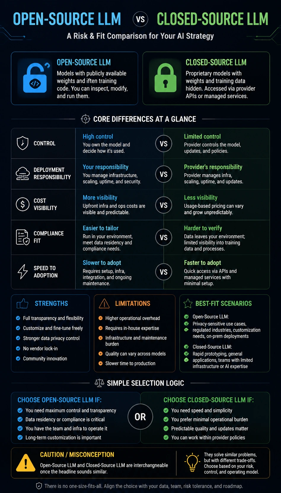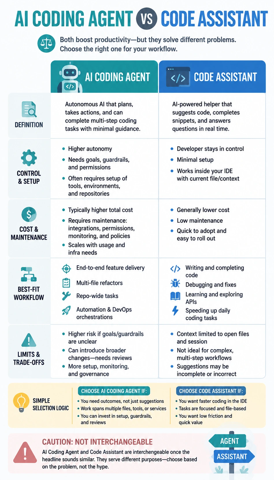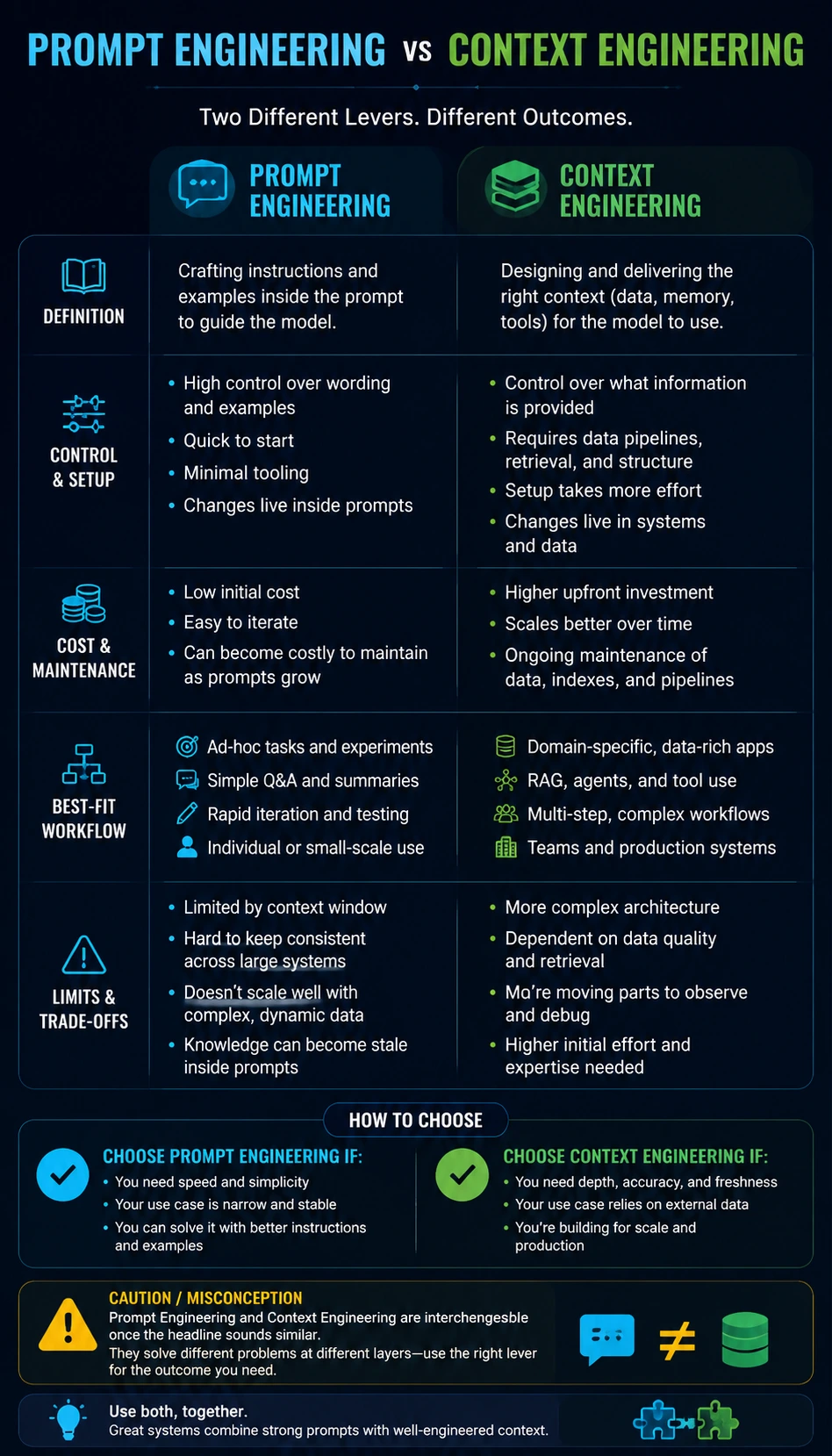
About this comparison infographic
This Prompt Engineering vs Context Engineering Comparison Infographic helps readers compare prompt engineering vs context engineering through a visual framework built for fast understanding on desktop and mobile. Instead of acting like a generic poster, it uses a maturity comparison structure so the viewer can see what each option means, where the biggest trade-offs appear, and how the choice changes across practical scenarios. The infographic compares definition, control and setup, cost and maintenance, best-fit workflow, and limits and trade-offs, then turns those differences into a clear selection logic that is easier to scan than a long article or dense table. It is useful for product managers, developers, technical founders, and educators who need a crisp explanation before writing, teaching, presenting, or choosing between similar options. The image is designed to solve one common understanding problem: help readers decide when Prompt Engineering is a better fit than Context Engineering, and when the reverse is true. It also addresses a frequent misconception, namely that Prompt Engineering and Context Engineering are interchangeable once the headline sounds similar. That makes the visual especially helpful for SEO discovery, image search, social sharing, and reusable comparison content. Because the topic naturally involves contrast, fit, and limitations, it works especially well as a visual format rather than a plain block of text. This page also supports use cases such as technical education, team onboarding, and product explainers without turning the explanation into personal advice.