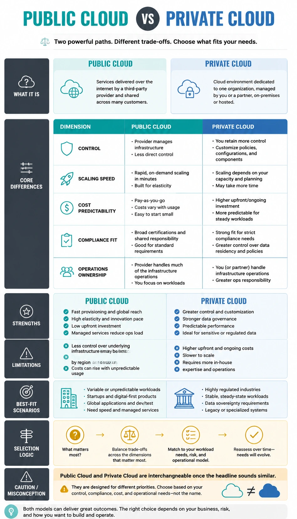
About this comparison infographic
This Public Cloud vs Private Cloud Comparison Infographic provides a structured visual explanation of public cloud vs private cloud for product managers, developers, technical founders, and educators. The goal is not just to define each option, but to help the reader understand the logic behind the comparison. Using a stack comparison format, the infographic compares control, scaling speed, cost predictability, compliance fit, and operations ownership, surfaces practical scenario differences, and highlights what people tend to miss when they only look at a headline summary. The infographic is useful when someone needs to decide, teach, write, or communicate around a topic where two or three options sound similar but behave differently in practice. It addresses the question of how to help readers decide when Public Cloud is a better fit than Private Cloud, and when the reverse is true, while also correcting the misconception that Public Cloud and Private Cloud are interchangeable once the headline sounds similar. This subject fits a visual comparison format because the strongest insight comes from contrast: viewers need to see where each option wins, where it becomes limited, and what trade-offs appear under different conditions. That makes the page valuable for technical education, team onboarding, and product explainers, especially when mobile readability and quick scanning matter.